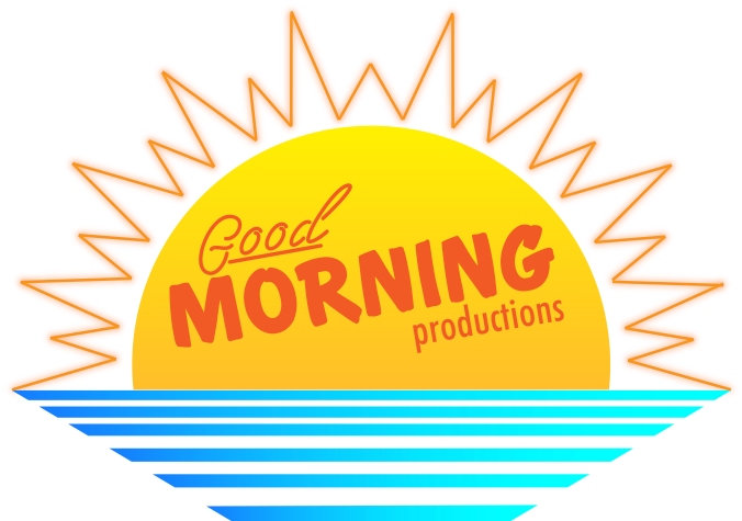
For this project I decided to create a logo for my fictious production company, Good Morning Productions. This logo would be use on promotional material for the company and be included before any movies or TV shows made by the company. Think like the Universal world logo or the Disney castle that appears before movies made by those respective companies.
My main influences for this logo were the BBC News logo of the ’80s, the tropical pop art aesthetic, and the Miami Vice logo. The rising sun and parallel blue lines were a very popular aesthetic, but the ’80s BBC logo did it in a very classy and simplistic way, so I drew from that. The tropical pop art aesthetic can be seen in shows like Miami Vice, it involved bright gradient colors and orange and blue colors. I also searched designs that are a part of the Vapor Wave movement.
All my favorite movies and TV shows came from the ’80s so that’s why I decided to mirror that style. The rising sun is to symbolize the beginning of a new creative area and new opportunities that are right on the horizon. The parallel blue lines are supposed to mimic a power charger showing that with this company you’ve reached maximum power and potential. The font is inviting and but also still unique, like the company it represents.
From the beginning I wanted to incorporate a sun/sunrise into my design like I did for my photoshop project. I had a very clear idea of what I wanted to so and did not stray for from my sketch except when it came to the rays of sunlight. Originally, it was going to be tiny rectangles circling the sign or tiny triangles coming from the sun. I went with a line because I wanted something that flowed and didn’t distract from the overall design, so I figured just the line that spikes out would be a good middle ground.
I wanted to make sure that my design was not only recognizable but scalable, that’s why I stuck with mostly basic shapes. I think this design could even be recognizable without text since it is unique but also simple.
There were not a lot of elements I needed to collect to make this project. The only part I needed to search for was different fonts. Luckily, in a previous tutorial, a free use font website was given. I didn’t end up using any of the fonts that were already saved to my computer. It is a good resource to have though.
When it came to designing the project in Illustrator I used the trim feature to cut the circle I was using in half and the duplicate feature to reflect the whole project who that each side would be symmetrical. I also used gradients for the colors and put a glow effect on the sun’s rays. I think in my final I would like to use this glow effect a little better and make it stand out more so in the mean time I’ll look up tutorials on how to do so.
The biggest challenge I faced while constructing this project was trying to make everything symmetrical. I wanted the peaks of the sunrise to all be equidistant apart and to line up on the overall design. I also want there to be an equal amount of line space on either end of the sun where the last blue line points out. This was tricky because I wasn’t sure how to achieve this effect without just having to eyeball it. I eventually found out if I turned on the grid I could also make shapes and lines snap to parts of the grid. This way I could count out the even number of squares on either side so it would line up perfectly.

After re-evaluating my logo again and examining with a critical eye for myself I have a couple of areas I’d like to approve on. The first being the text on the sun in the logo. I was not completely sold on this text when I first put it in the logo and looking at it again I would really like to change it. Mostly it’s the word productions, I think it looks bland. I wanted this part of the logo to look more ordinary, but it looks very un-inspired and plan looking back. I have a couple of other new fonts I found on free use font websites, so I’ll try those out. I would also like to have the words good, morning, and productions line up better. I still want they slightly turned but all at the same angle. This will be an easy fix, since I discovered I can manually insert the degree in which something is rotated using the rotate tool. I like the blue and yellow and orange color scheme a lot and would like to change the red text to be brighter, so it can pop more. Some more glow around the rays of the sun would be helpful as well.
LikeLike
I love your logo! It’s definitely memorable and love that you incorporated an 80s vibe to it, as you said in your post.
What I really like about the logo is the color scheme. It’s very bright and happy and considering the theme for your project, it fits it really well. It has a good amount of simplicity that which is nice since its such a bold looking logo. I think the font used is also a good choice.
The only thing I see changing for this logo is the word “productions” since in comparison with the other font used in the text it isn’t as exciting. Maybe just using the same font used for the word “good” for the word “productions” so that it’s a little bit more interesting but still ties in together with what was already used. Another small thing is maybe adding a bit more gradation to the logo itself. I can see a small use of gradation since I can see some areas being darker in color, but having a bit more gradation could help it be more of a bold logo.
Other than that, I think the logo itself is really amazing. I can see it being used as a real logo somewhere for sure!
LikeLike
First off, I love your blog! Everything about it is exactly what a reader wants to see. The bright colors really get my attention and brighten up the vibe. I also really like how you took the time and effort to create a background for your blog and include different shapes and colors. The post you created for your logo sketch was really specific and really shows how much thought you put into it. Also, your actual logo is super bright and welcoming which is exactly what a reader wants to see. One critique I would give is maybe sorting your posts and putting them in a different format on your homepage so the reader can jump from post to post instead of scrolling. Another thing I would suggest is maybe centering your logo a tiny bit more and maybe taking away the white background and make it a cut out of your actual logo.
LikeLike
Hi Noah! First of all, I love the color scheme you used for your blog! It is very cheerful and goes well with your story. I also love your logo design a lot, and I can tell you have mastered good Illustrator skills. I like how the logo is simple yet fits your story and is also memorable. I can’t think of any major suggestions because I think your logo is really good as is; however, as you said, maybe you can try changing the fonts a little or adding a stroke to the text. Other than that, I think you did a really good job!
All the best!
LikeLike