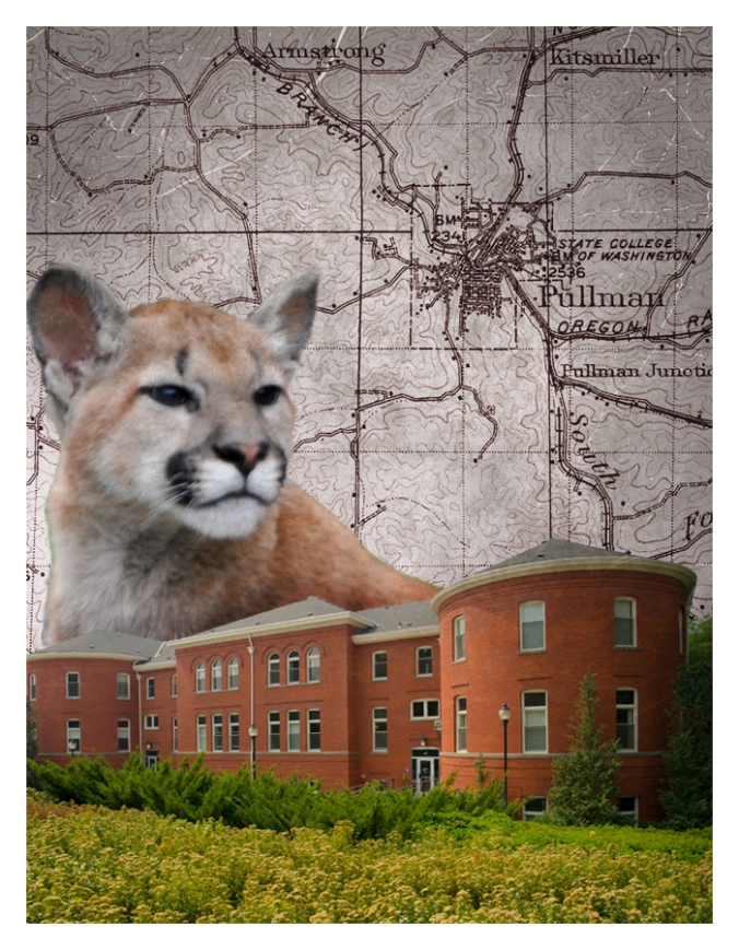
Here are my completed Illustrator Tutorials


Here are my completed Illustrator Tutorials


This poster I’ve created is meant to be an advertisement promoting my fictitious TV/movie production company, Good Morning Productions.
This project was inspired by a couple of things. The main inspiration I drew from was old poster adverts movie and TV studios would put to promote themselves and the projects they’ve made as well as try to attract new people to join the studio. I have a collection of these old posters on my computer as well as a book featuring many of them so finding reference was not hard.
I also drew inspiration from PT Barnum circus advertisements. This is where I got the idea for the colored border. Barnum’s circus ads always had really nice colors too that really popped and that inspired me to include the sunset and the purple Hollywood hills.
Once I came up with the general idea I started sketching out what I wanted the poster to look like. I wanted to capture the glamour and sleekness of old LA so I chose to use the Hollywood hills and a spotlight, both cornerstones of old Hollywood and TV production. Then I knew I wanted to include photos of me and my team creating content so I thought the best way to do this would be to include behind the scenes photos within film strips, so it still makes my overall aesthetic and works with the similarity aspect of the Gestalt Theory.
Collecting photos was not too difficult. I have been making videos for years now and over that time I’ve accumulate some nice behind the scenes photos. Originally, in my first draft the pictures I included were more abstract and in my critiques this was mentioned. So, for this final I decided to use more explicit pictures that clearly show me and my team using cameras, lights, green screens, and other tools used in the production world. I also decided to increase the saturation
There were a few graphics that I also used. I got these off of various free use picture websites and the links and what type of creative commons each graphic falls under is listed at the end of this blog post.
Now that I had gathered all the necessary elements it was time to assemble my project. As I mentioned, I wanted to include a lot of colors and I thought the best way to do this would be to use color gradients. I also decided to use this tool because sunrises, like the one I included in the background, are usually a spectrum of colors that starts with one shade of orange or yellow and then morphs into a more pinkish color. I also used a color gradient to give the light emitting from the spotlight a more translucent look, like an actual spotlight’s light beam.
Since I used analogues colors for the sunset and spotlight, I knew I would have to use a complementary color to the orange hues for the Hollywood hills. When I looked at a color wheel the color most complementary to orange was purple. This works on another level too, since sunrise often makes landscapes appear to be in a purplish hue.
I decided the font for the production company’s name, Good Morning, should be bubbly, open, and inviting so I went with a pre-saved font on my computer called Agent Orange. This font is sans-serif so that production company’s name can be visible on the poster from far away. Then for the word productions I wanted it to look more professional.
Finally, I used the texture trick we learned during the Photoshop tutorials to blend my final poster with a picture I took of a folded piece of paper. This was to tribute the old posters I based my project on and make my project look more real.
During my draft the biggest difficulty I faced was trying to crop all the graphics I used so they had transparent backgrounds. Often times little pieces of the background would be left on the image when I used the magnetic lasso or magic wand tool. Originally, to remedy this I used the feather tool. Then on my final, I further solved this problem by using the Refine Edge tool to smooth, feather, and contrast the edge of the images to make them look as clean as possible.
Another critique I got during the feedback portion of this assignment was the edges of my poster were too clean and straight and ruined the illusion that it was an old poster. This was challenging because everything I tried to make the edges of the poster look folded or cut ended up look sloppy or not convincing. Finally, I found the puppet warp tool and after playing around with it for a while I think I ended up with a pretty convincing effect.
Sources:
Hollywood Sign:
https://dumielauxepices.net/wallpaper-3989234
Public Domain/Free Culture
Film Strip:
https://www.freepik.com/free-vector/film-roll_1020923.htm#term=film&page=1&position=0
Free Commercial Use with Attribution
Spotlight:
Free Use with Attribution

For this project I decided I wanted to make something to promote my production company and show what I’ve made and plan to make. To do this I decided to harken back to the early days of film and TV production where different studios would put out poster promoting the projects they’ve made and try to drum up clients for future projects. I have a book of this type of old posters and I also looked online.
When it came to collecting the images needed for the project I lucked out because I had been taking behind the scenes photos from the different projects I’ve been working on for over three years now. Besides that, all the other graphics I used I either made or got off freepik.com under different creative commons licenses.
Now that I had all my materials collected it was time to start putting the project together. I recently learned how to use color gradients, so I made one for the sunrise in the background and the spotlight that contains the production company’s name. I also utilized the blending tool to make the project more closely resemble an old movie poster/ production company ad. I also used a layer mask for all the photos inside of the different film stripes.
I knew I wanted to include pictures taken from behind the scenes of previous projects I worked on. I thought the best way to include these was to put them inside of film stripes. Once I had this idea I decided the overall aesthetic of the poster should be very old stylized images of Hollywood. This was the similarity aspect of the Gestalt Theory we had read about.
Moving on to the color of the poster I knew I wanted to incorporate a sunset because it shows style and class. To get this effect I used the color gradient tool and used analogues colors to get a product that would be pleasing to the eyes. Then when it came down to what color to make the Hollywood hills I knew I’d need a color complementary to orange so using the color wheel I ended up with purple. This is nice too because landscape can get a kind of purplish hue during a sunrise, so it works on two levels.
For the font I wanted something bubbly and inviting for the main name of my production company, Good Morning, so I went with a font that was pre-saved on my computer. I made sure that it was sans-serif so that the name could be read from farther away. Then for the word productions I went with something a little more professional.
The biggest difficulty I faced while making this project draft was trying to get photos to crop right. I unfortunately didn’t find many premade free use png images to use for this project so for most of the graphics I had to crop around a jpg image to give it a translucent background. This is problematic though because often the magnetic lasso tool or the quick select tool will leave little specks of the original background still attached to the image. The most useful work around for this I found was to feather the image and covert it to black and white then recolor it if the graphic is only one solid color.
SOURCES
Hollywood sign:
https://dumielauxepices.net/wallpaper-3989234
Public Domain/ Free Culture
Film Strip:
https://www.freepik.com/free-vector/film-roll_1020923.htm#term=film&page=1&position=0
Free Commercial Use with Attribution
Spotlight:
Free Use with Attribution
For my project I want to create a promotional poster for my production company. Many production companies have these types of posters to attract potential movie directors and producers to sign with their production company. All the images I’ve included are photos I’ve taken during different video projects I’ve been involved with. Hopefully, including these images will help show what kind of projects that will go on at my production company.
Here are my completed Photoshop Tutorial images.


